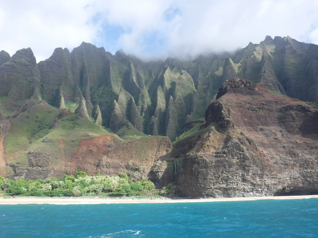
Before:
After:
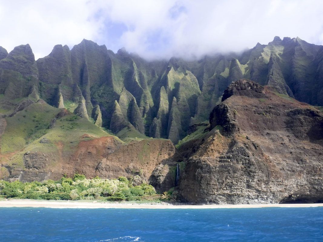
This picture was slightly crooked to begin with so, using the beach as my reference, I grabbed the straitening tool and made it more level. I then let camera raw make some of its own corrections to the image. I didn't like how light it made some of the darker areas and shadows, so I brought those back down a little bit. I adjusted the sharpness so the mountain peaks would draw the eye upward a little more.
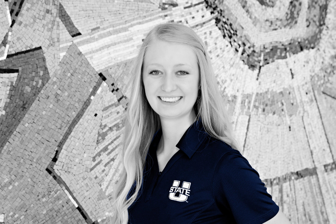
This photo originally had a lot of color in the background. I wanted to transform this by making the focus be on the Utah State shirt and I think the deep Aggie blue really contrasts well against the different grey tones from the wall. I used the magic wand tool to carefully outline the shirt and logo.
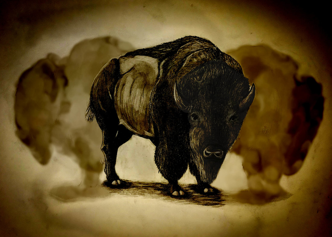
This was originally a sketch that I did by hand. When I drew this, I wanted it to feel like a quick drawing accentuated by the contrast of the off-white art board. In the original drawing, the misty buffalo in the background were a lot more defined. After bringing this into photoshop, I wanted to play around with it and see how I could change it. I started by sharpening it and bringing up the darks a little bit more. I then cropped it to a 5x7 and used the art history brush tool over most of the picture. I went back and used the history brush in order to bring back the detail of the middle bison. Lastly I added a filter and a vignette in order to it look old and tattered.

Photo retrieved from pexels.com.
I had a lot of fun with this display. I first used the quick select tool on the woman's eyes, and then inverted my selection in order to change everything else to black and white. I wanted the eyes to really stand out but I found that her natural color was a perfect hue. It was especially fun to add the words and come up with a simple slogan. I used the bright shade of blue that is in the USU STARS! GEAR UP logo so that my display would tie in better with that color scheme. I chose simple fonts yet different enough from each other so it would work well together. The final step I took was to incorporate the Utah State logo. I wanted the logo to look like it was on the book so I tilted the text slightly to match the angle.
I had a lot of fun with this display. I first used the quick select tool on the woman's eyes, and then inverted my selection in order to change everything else to black and white. I wanted the eyes to really stand out but I found that her natural color was a perfect hue. It was especially fun to add the words and come up with a simple slogan. I used the bright shade of blue that is in the USU STARS! GEAR UP logo so that my display would tie in better with that color scheme. I chose simple fonts yet different enough from each other so it would work well together. The final step I took was to incorporate the Utah State logo. I wanted the logo to look like it was on the book so I tilted the text slightly to match the angle.
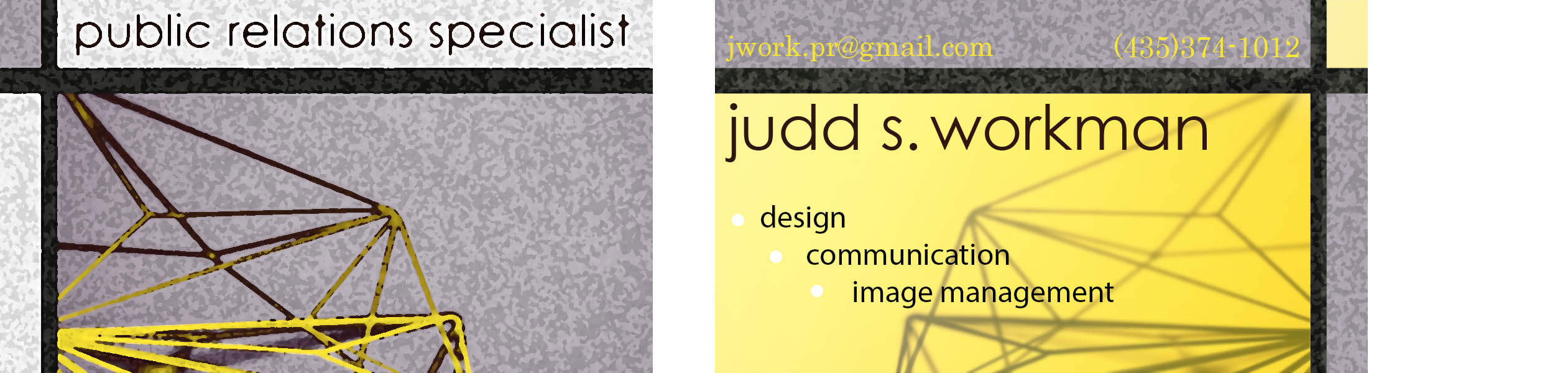
With my business card I wanted to use all lower case fonts. I think in this instance it works well. The font, with the circular shapes, contrasts the straight lines and sharp corners of the image in the background. I wanted the black lines to match up on both the front and the back in order to link the designs together. I also wanted a simple color scheme that also drew attention to my name.

Photo retrieved from pexels.com.
You can probably tell by now that I am a fan of the neutral background colors with vibrant focal points. I really enjoyed piecing this poster together. Especially utilizing the colors in the UCET logo to help tie everything together. In order to make sure the text in both right-hand corners were clearly visible, I created gradients fading from black to white with a mid to low opacity. I went back afterwards and erased the gradient over the piece of crumpled paper so that the color would stay bright in that area. I aligned the text by the right edges, with the exception of the UCET logo and website on the bottom. I wanted that part to be more visible so I added the white stripe behind the text. I think the fonts work well together and still keep the professional look.
You can probably tell by now that I am a fan of the neutral background colors with vibrant focal points. I really enjoyed piecing this poster together. Especially utilizing the colors in the UCET logo to help tie everything together. In order to make sure the text in both right-hand corners were clearly visible, I created gradients fading from black to white with a mid to low opacity. I went back afterwards and erased the gradient over the piece of crumpled paper so that the color would stay bright in that area. I aligned the text by the right edges, with the exception of the UCET logo and website on the bottom. I wanted that part to be more visible so I added the white stripe behind the text. I think the fonts work well together and still keep the professional look.
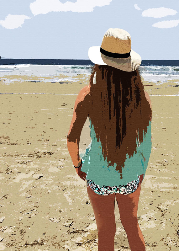
This was taken on the beach in Mexico. The original photo wasn't all the interesting or good quality. I wanted to make it look more like a crude painting so I added a couple different filters in order to bring down the brightness and make the colors more blocky. I love the contrast and tones that I was able to achieve on the hat. The shadows in the hair really draw the eye up to the ocean and horizon.

Photo retrieved from pexels.com.
Conservice is the company I currently work for, so I wanted to create something that was relative to my daily life. Even though it was tedious, I enjoyed incorporating the coins in this photo. It took some time using the wand to outline the coins and pull them from their original photo, but it was worth it. I wanted to keep things simple and straight forward with the message. Since I don't have rights to use this company's logo and color scheme, I wasn't able to incorporate any of that.
Conservice is the company I currently work for, so I wanted to create something that was relative to my daily life. Even though it was tedious, I enjoyed incorporating the coins in this photo. It took some time using the wand to outline the coins and pull them from their original photo, but it was worth it. I wanted to keep things simple and straight forward with the message. Since I don't have rights to use this company's logo and color scheme, I wasn't able to incorporate any of that.
Background photo retrieved from pexels.com
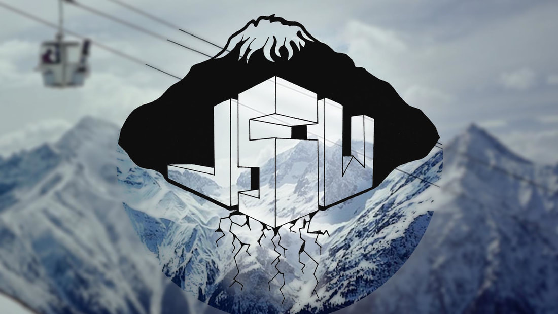
I had a lot of fun creating my own logo. The center image I did by hand and scanned into my computer. I wanted the mountains to be big part of the design, but not the focal point. I outlined my logo in a circle to contrast the edges of the letters, and I blurred everything on the outside of that circle. Lastly, I dropped the opacity of the letters so that you would be able to see the mountains in the background.
I had a lot of fun creating my own logo. The center image I did by hand and scanned into my computer. I wanted the mountains to be big part of the design, but not the focal point. I outlined my logo in a circle to contrast the edges of the letters, and I blurred everything on the outside of that circle. Lastly, I dropped the opacity of the letters so that you would be able to see the mountains in the background.
